Responsive WordPress Website Design: Why Your Business Needs a Future Proof Web Design Agency Approach
More than 70 percent of web sessions now happen on phones and tablets. If your site forces visitors to pinch‑zoom or wait for oversized images, they leave quickly.
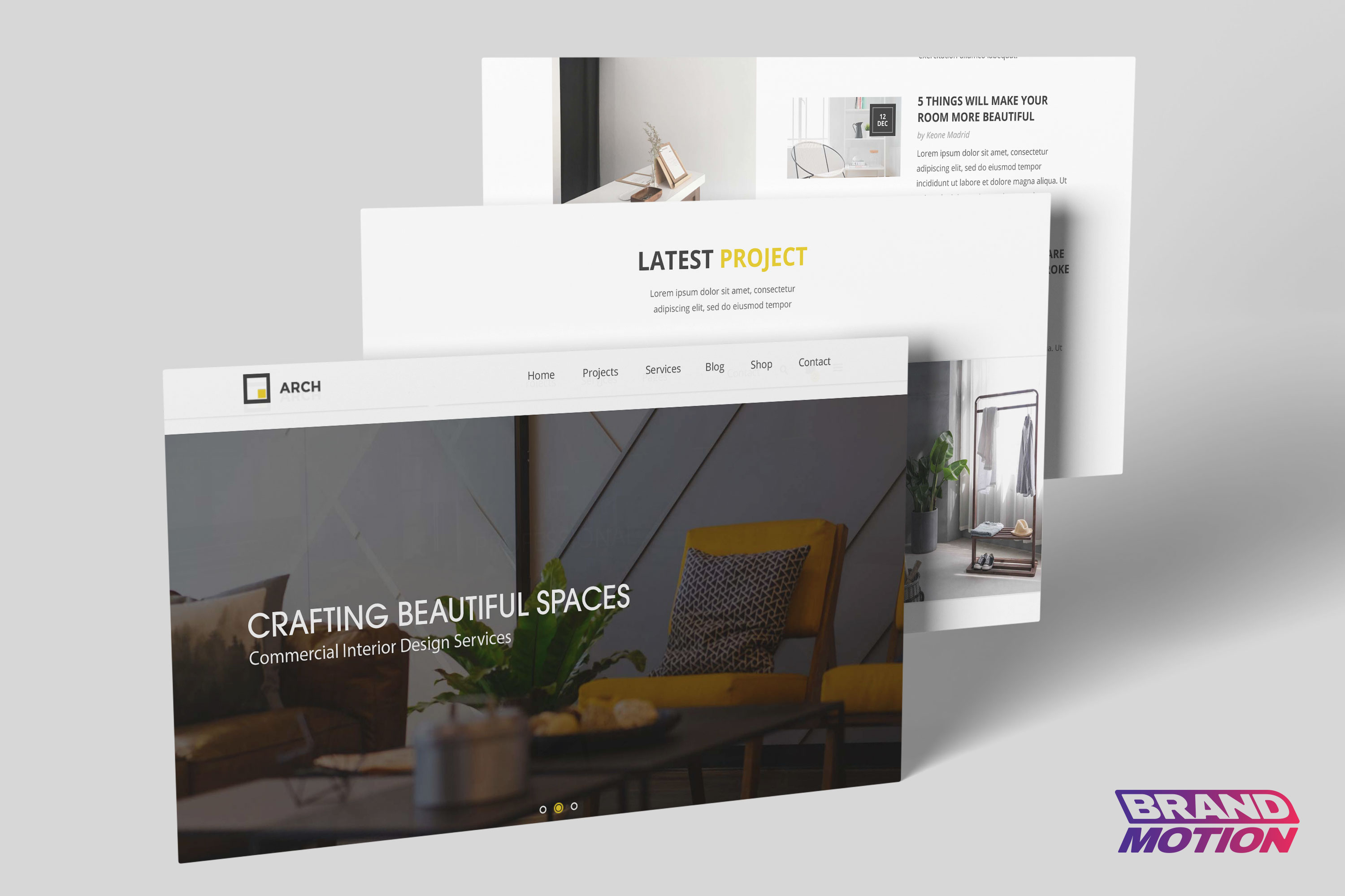
Responsive Website Design adapts layouts, typography and media to any screen size. Combine that flexibility with the plugin ecosystem of WordPress Website Design and you have a platform that scales with your brand. In this article we explain how a professional Web Design Agency blends responsiveness, WordPress best practice and conversion thinking to deliver a site that truly supports your business.
1. What Exactly Is Responsive Website Design?
Responsive design uses CSS media queries, flexible grids and fluid type so one code base serves every device. Maintenance stays low and Google rewards your effort because mobile friendliness is a ranking factor.
Quick checklist
-
Fluid grid built with relative units such as percent, rem, vw
-
Images that never overflow containers
-
Breakpoints driven by content, not specific devices
-
Touch targets at least 48 pixels
-
Core Web Vitals in the green (Largest Contentful Paint under 2.5 seconds, Cumulative Layout Shift under 0.1)
2. Why WordPress Still Dominates for Business Sites in 2025
-
Open‑source freedom. No vendor lock‑in and thousands of contributors.
-
Plugin power. Need booking, LMS or multilingual features? A vetted plugin probably exists.
-
Headless options. WordPress can act as a headless CMS for Jamstack front ends.
-
Editor usability. The Gutenberg block editor lets marketers update pages without calling a developer.
With a solid design system and performance budget, WordPress gives you an enterprise‑grade site that your team can still edit at 5 p.m. on a Friday.
3. Responsive Plus WordPress: The Winning Combo
-
Theme foundations. Start with a lightweight, accessibility‑ready base theme to avoid code bloat.
-
Component thinking. Build reusable blocks such as hero, testimonial and pricing sections so new pages inherit the same rules.
-
Conditional loading. Load scripts only for the blocks that appear on the page, which is vital for mobile speed.
-
Global style tokens. Define colour, spacing and typography in
theme.jsonso design tweaks roll out site wide in minutes.
Get design inspiration from our deep dive into Web Design Trends Mid 2025.
4. Five Responsive WordPress Best Practices We Live By
| Best Practice | Why It Matters | Quick Win |
|---|---|---|
Use clamp() for fluid type |
Headings stay legible on every screen | font-size: clamp(1.25rem, 2vw + 0.5rem, 2.75rem); |
| Serve AVIF or WEBP | Cuts image payload by up to 35 percent | Enable formats in functions.php and regenerate thumbnails |
| Lazy‑load below‑the‑fold assets | Improves Largest Contentful Paint | Add loading="lazy" to <img> tags |
| Prefetch critical fonts | Prevents flashes of unstyled text | <link rel="preload" as="font"> |
| Use logical properties | Ready for right‑to‑left languages | margin-inline-start, padding-block |
5. Do Not Forget Conversion. Design Still Needs to Sell
A beautiful responsive site is pointless if people do not enquire or buy. That is where CRO comes in. Before launch we can run heat mapping and A‑B tests to spot friction points, an approach we unpack in What Is CRO?.
6. Getting Started With Your First Responsive WordPress Project
If you are new to professional web builds, use this simple roadmap to set yourself up for success.
-
Define measurable goals. Decide what actions matter most, for example form submissions, downloads or product sales.
-
Audit existing content. Gather current pages, documents and media. Label what to keep, update or retire.
-
Sketch user journeys. Outline the clicks a visitor should take from entry point to goal. Card sorting workshops can clarify structure.
-
Choose reliable hosting early. Look for servers with built‑in edge caching, SSL certificates and automated backups.
-
Create a staging environment. Always test new features away from your live domain.
-
Adopt an agile workflow. Release small batches of work every one to two weeks so stakeholders can give timely feedback.
-
Monitor performance continuously. Use tools like PageSpeed Insights and the WordPress Site Health panel to catch issues before they cost you traffic.
For real‑world examples of how this groundwork boosts results, see Great Websites Matter.
7. Next Steps
Ready for a site that loads in under two seconds, adapts to any device and turns browsers into buyers? Explore our website design services and see how we can help.
Key Takeaway
A modern website is more than a digital brochure. It is a growth engine. By combining Responsive Website Design principles with proven WordPress Website Design techniques and partnering with a data‑driven Web Design Agency, you give your brand a strong foundation for digital demands of today and tomorrow.